Devlog 9 - Settings Menus
Published: July 30th, 2021
So this week I've been taking a stab at reworking the settings/options UI in the menu. For reference, this is what the settings screen looked like at the beginning of the week:
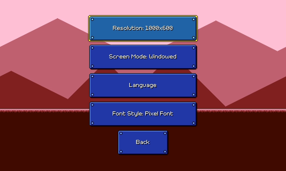
It's...okay. Well, sort of. The styling is consistent with the rest of the menu and it's pretty simple to understand, so there's no problem there. You simply tap the respective button (or press enter with it highlighted) in order to swap through the choices for each setting.
The problem is that this doesn't really work out for all types of settings. In particular, volume settings are much better served using some sort of left/right slider that allows you to both increment and decrement the value. Same thing with a windowed resolution selector -- it's a little awkward to have to cycle through all options unidirectionally without being able to see all of them.
Some of these options would also benefit from some sort of additional explanation. A bunch of the accessibility options, for example, or maybe a toggle for whether successful audio cues are prescheduled vs dynamic.
Traditionally this sort of thing is handled by having each setting row show left/right indicators that allow you to scroll through the options. You can also put in a description box for showing info about the currently-highlighted item:
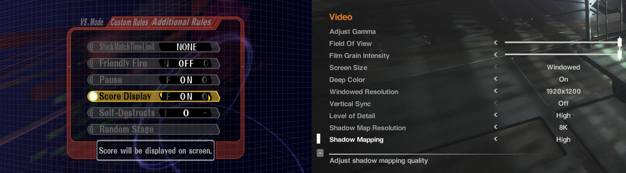
This is a tried-and-true solution, but the problem here is that this UI really doesn't work well for touch/mouse interaction.
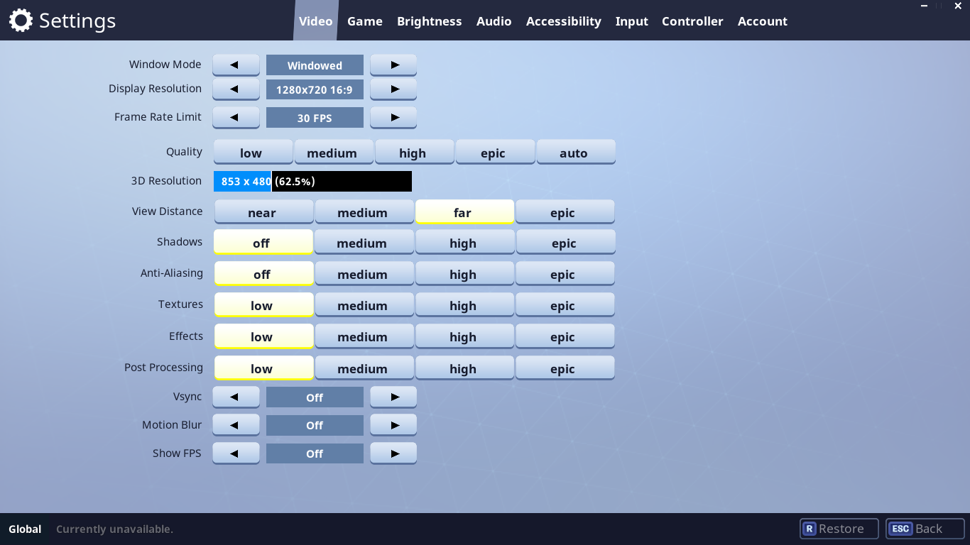
For touch/mouse controlled games you generally have individual buttons for each available option, or tappable left/right buttons, as well as sliders, so everything is interactable without needing to first have a "selected row":
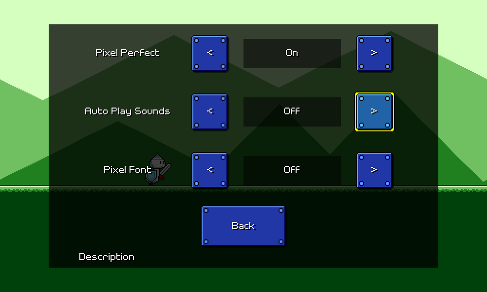
Again this works OK, but it's not obvious to me how to best apply keyboard navigation to this. Here was my initial attempt at trying to fuse the two navigation modes together:
...no good. You can tell that the two navigation modes are really just fighting each other. It's kind of awkward trying to have left/right arrows that are trying to be indicators of keyboard movement, but also trying to be tappable buttons. I think we have to get rid of the concept of a "highlighted row", or at least clean up the UI so that it's reflected more clearly.
Interestingly enough, Fortnite (the one easy example I could think of where a game is designed to handle all these input modes) actually does take this hybrid approach:
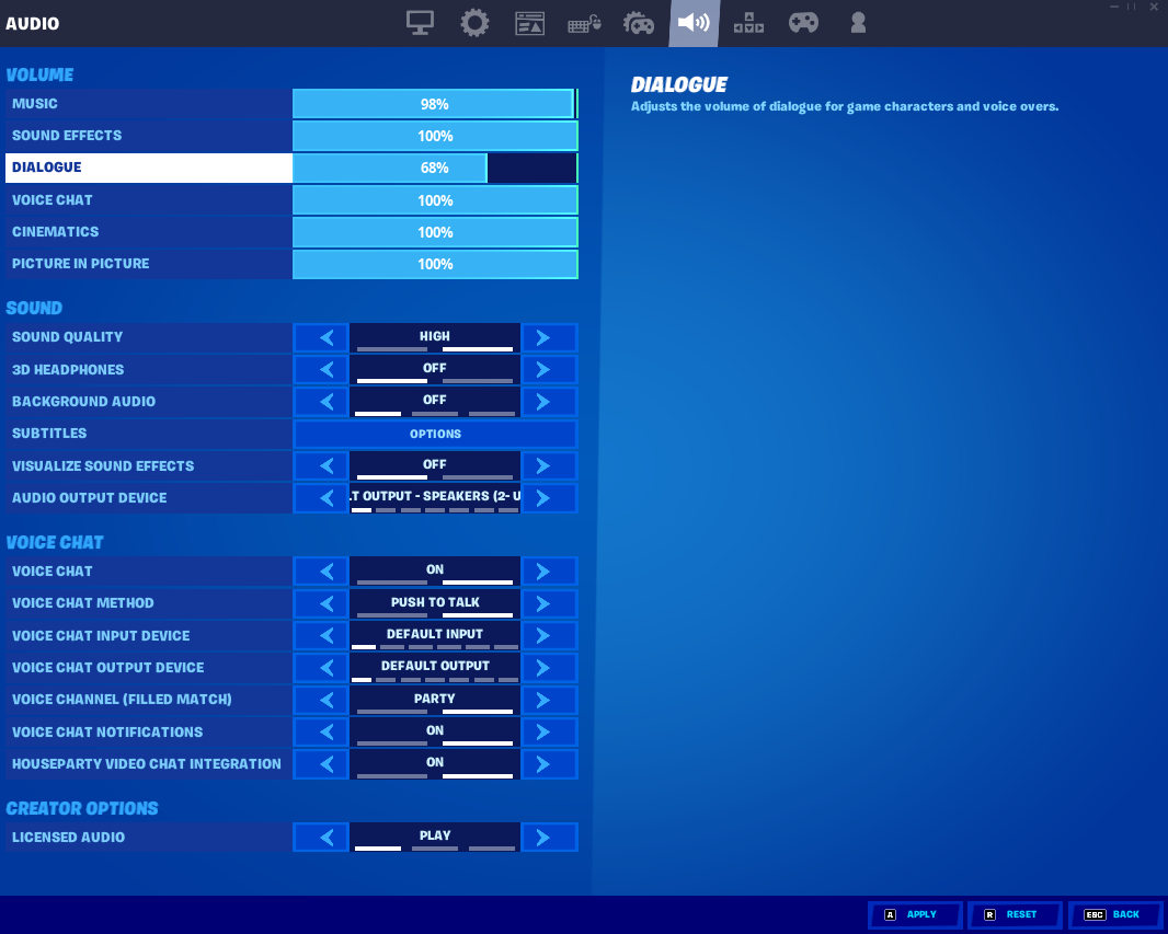
So it IS workable if I decide to go down this route, but I need to style my menu differently in order to get it to look right. Curiously, Fortnite didn't seem to allow me to navigate the menu with a keyboard alone -- I had to plug in a gamepad to get that style of navigation working. I guess they assume that if you're going to play with a keyboard, you're also going to be using a mouse anyways.
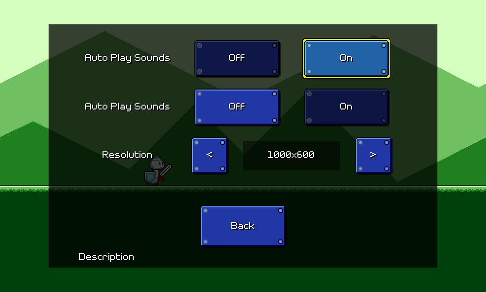
Here's a different idea:
I actually think this is pretty promising. The keyboard/gamepad navigation experience definitely suffers a bit because navigating to these different onscreen buttons isn't the most graceful, but it's easy to understand and more importantly, follows the same UI paradigm as all of the other menus, so you don't have to learn a new system of thinking about the interface.
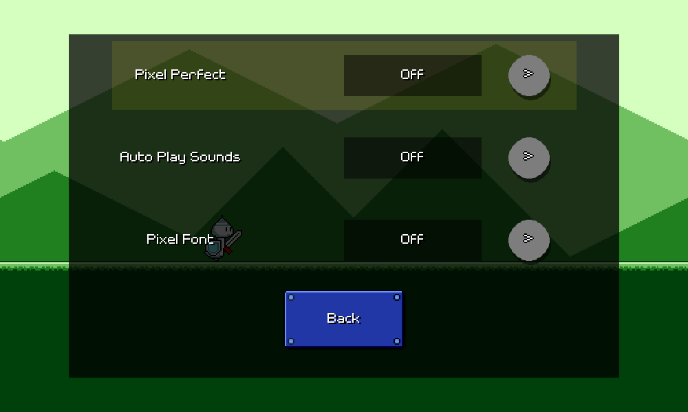
Of course, it doesn't really make sense to have arrow buttons for binary settings that only have on-off toggles. We should just call out the two values instead, like this:
That's starting to make a lot more sense now. The description text will show information for whatever option you have your cursor hovering over, so I also like the fact that you can read about a particular choice before applying it. Of course, I'm now adding a new "darkened" state to all my buttons, so I have to refactor that logic/UI again (sigh, haha). In the end a lot of these UI screens need to be built out by hand, but it's important to reuse refactorable shared components so that this kind of change can be done without too much pain.
After a bunch more tweaking and iteration, I've ended up with something that I'm pretty happy with:
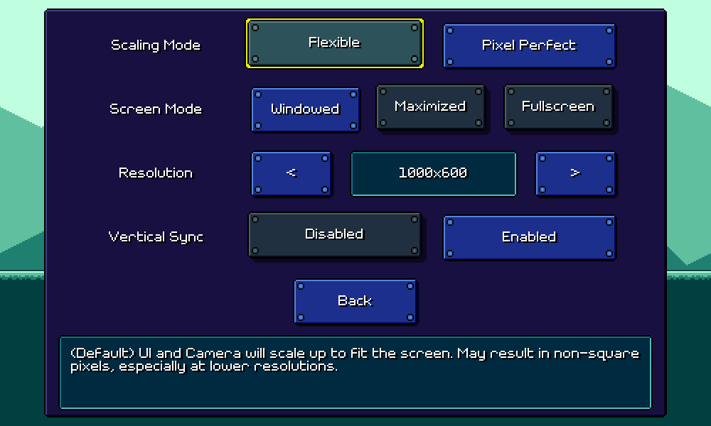
The layout alignment gives the menu a very tidy feel despite the fact that there are differing elements per row. Notice also that I've given the disabled options a bit of a "raised" look with a slight offset and a more distant drop shadow, so that activating an option visually looks like pressing in a button.
There's still a ton more work to be done here (all of these text labels need to be put into the localization database...), but that's all for now!
<< Back: Devlog 8 - Menu Rework
>> Next: Devlog 10 - Latency Calibration