The Music Box Post-mortem
This is a post-mortem writeup for The Music Box.
This was my 16th time competing in Ludum Dare! From the comments posted on our game it seems that I've gained a handful of followers who have been checking out my games for some time now, which is super awesome (thanks so much!). This time around we entered the 72-hour Jam and had a team of 3 -- myself on programming and audio, @xellaya doing graphics and character design, and @acexl03 helping out with ui designs and some additional artwork. We ended up with an adventure game based around a "Groundhog Day"-like time loop puzzle.
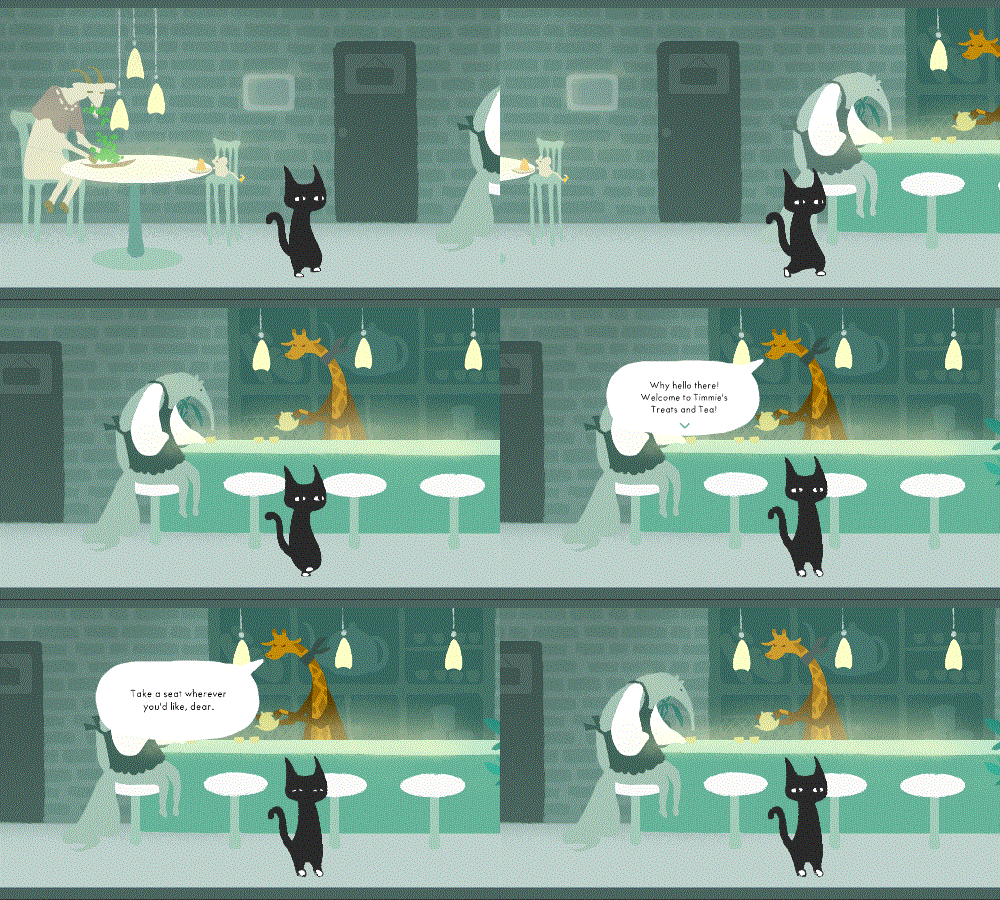
Let's first take a look at our results!
Overall:    17th  (4.308 average from 67 ratings)
Fun:        60th  (3.939 average from 68 ratings)
Innovation: 270th (3.338 average from 67 ratings)
Theme:      618th (3.182 average from 68 ratings)
Graphics:   21st  (4.652 average from 68 ratings)
Audio:      4th   (4.576 average from 68 ratings)
Humor:      61st  (3.833 average from 62 ratings)
Mood:       12th  (4.385 average from 67 ratings)
The average of all 8 scores is 4.03. Overall we did quite nicely! 17th place is not bad at all, and I almost sneaked into top 3 for audio again -- but alas, at this point I've realized that you can only really be a winner in audio if you integrate audio into your gameplay in some clever way, or make super catchy music. More importantly, we got our highest ever score and placing in graphics -- big shoutout to @xellaya for really going above and beyond with the artwork this time around! We also got our highest ever score and placing in mood, which feels great as we really wanted to concentrate on narrative and adventure this time around rather than fancy gameplay mechanics.
Big shoutout to pjnovas who has updated the ldstats.info site to scrape data from both the old ludumdare.com site as well as the new ldjam.com site. You can view a graph comparing my results across all 15 of my rated LD entries (remember, we had no voting for LD36) at this link.
Since I have quite a lot of past data to compare to, I thought it might also be fun to see just how well I did relative to my other entries. Here's a comparison, out of all 15 of my rated entries:
Overall:    4.308 = 5th  (highest was Ripple Runner  with a score of 4.55)
Fun:        3.939 = 10th (highest was Ripple Runner  with a score of 4.44)
Innovation: 3.338 = 13th (highest was Rhythm Gunner  with a score of 3.97)
Theme:      3.182 = 11th (highest was Ripple Runner  with a score of 4.30)
Graphics:   4.652 = 1st!
Audio:      4.576 = 9th  (highest was Melody Muncher with a score of 4.88)
Humor:      3.833 = 3rd  (highest was Hyper Furball  with a score of 4.11)
Mood:       4.385 = 1st!
Average:    4.030 = 5th  (highest was Grow Your Love with a score of 4.23)
So for us, fantastic job in graphics and mood, pretty good job overall (and in humor), and not really notable anywhere else. Yes, that's right, an audio score of 4.576 is still worse than the majority of my other entries...
What about my personal goals? In my I'm In post this time around, I said that we were really hoping to make some sort of dialogue/narrative adventure game and focus on storytelling rather than gameplay itself (success!) In addition, I said that my 3 personal goals for LD39 were:
- Make a game that tells a story!
- Don't kill myself...take it easy and pace myself well!
- Really focus on designing the game out beforehand, don't rush!
Make a game that tells a story -- Check! The Music Box was our first ever adventure game, and we really focused on building a world and story (with a bit of a puzzle element). This was super refreshing and a nice change of pace, and I think we all really enjoyed it and are happy with the end product.
Don't kill myself -- ...fail. I was a total zombie Sunday night and didn't call it quits until quite late. However @xellaya had things even worse as unfortunately she needed to go in for work on Monday, meaning she needed to finish ALL the artwork we needed on Sunday night. Thankfully she was still able to deliver (though she barely got any sleep tha night). But I think we were all feeling pretty exhausted that night. Miraculously, I woke up on Monday morning feeling pretty good, and was actually able to power through without any real problems (there was one point where I felt a little jittery, but other than that I felt fine), so I'm quite thankful for that.
I think it was a combination of different reasons that we needed to work so hard on Sunday -- one was that @xellaya couldn't work at all on the game on Monday, another was that we just had a lot of things to do, and yet another was that we spent a lot of time designing and planning out the game before really starting on anything. I think most of that is fine, but next time I think we need to do a sanity check after we finish planning everything to see if we can reduce scope at all right off the bat, and see if the amount of work we have to do is reasonable.
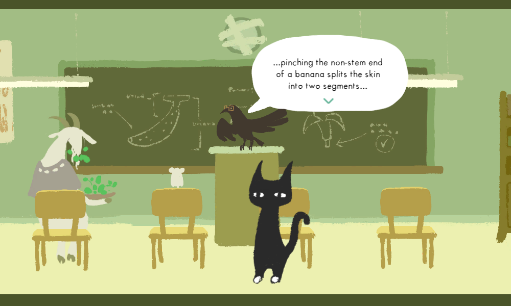
Design the game out beforehand -- Check! We actually spent all of Friday night and even the first part of Monday trying to think of a good idea and plan for the game. During that process @xellaya actually made a rough paper prototype out of some sticky notes, laying out the three different locations (school, restaurant, island) across each of the time of days (morning, afternoon, evening) as well as the different key items (safe code, key, crank) to make sure that the time loop made sense gameplay-wise. This ended up being super helpful as it helped me envision the different routes that the player might take through the game. I needed to make sure to sprinkle enough hints and interesting information throughout the different areas at the appropriate times so that you wouldn't just end up spending the first day learning nothing if you were unlucky. For example, I made sure that the mouse in the cafe in the afternoon tells you a hint about the island being accessible in the afternoon, so that you'd learn that information whether you went to the island itself or to the cafe.
After that I actually programmed a super quick text-only prototype in Unity using some basic GUI code, just to see how the game would play out. We tried it and it more or less worked as we wanted it to, so we started in earnest after that. All in all the prototyping phase was super useful and I'd definitely want to try it again depending on what the game idea was exactly. I think it especially helped us this time because we had no experience making adventure games or making these kinds of puzzles, so it really helped to see it in action. Of course, a lot of things ended up changing between the prototype and the actual game, but the core puzzle was more or less the same as the prototype. We added the safe combination as a way to force the player to go through at least 2 time loops, even with perfect information -- again, that was something that we added during the prototyping phase.
So...two out of three of my personal goals achieved. Decent! As always, let's next go over what went well and what didn't go so well for the project.
What went well
Prototyping
As I already mentioned above, we actually had a legitimate prototyping phase of the project this time, and this helped a lot in making sure that the time-loop puzzle was laid out sensibly.
Teamwork
More than any other jam I felt like this time we really came together as a team and helped build off of each others' work. There was a lot of collaboration and trading of ideas, especially when it came to the characters -- @xellaya did the initial designs and with @acexl03 serving as a sounding board to bounce ideas off of.

As you can see above, the initial sketches already had a lot of personality in them, so it was really easy for me to envision the mood and feeling of the different characters as I was coming up with their dialogue. Since I was also in charge of the gameplay, I let @xellaya know where each of the characters should be drawn for the different locations and different times of day. That way, she could just focus on drawing them out rather than having to be concerned about where everything should be, whether a character should appear in the morning vs in the afternoon, etc.
Speech bubbles and UI design
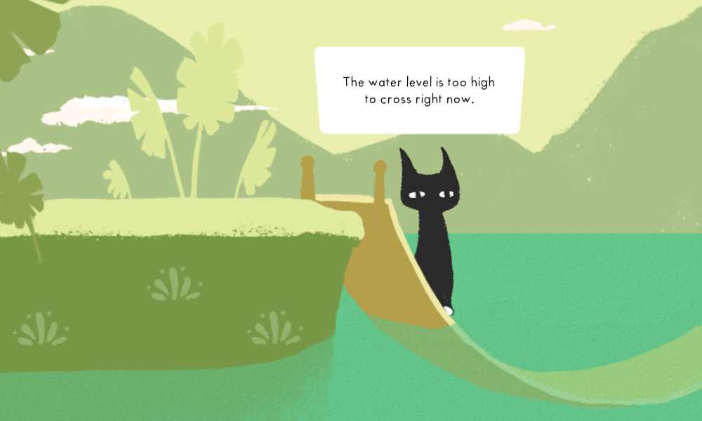
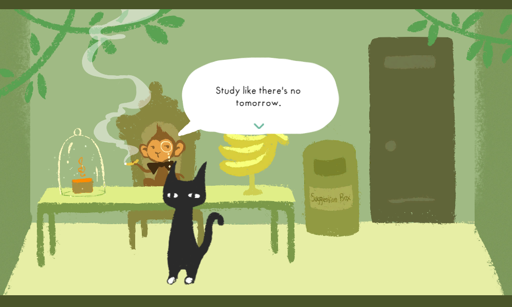
@acexl03 really helped advise us here and the design of the dialogue bubbles were really all his doing (with me being responsible for putting it into code). He also drew up the initial room screen with the subtle-yet-clear posters indicating the game controls to you. The text bubbles worked really nicely and I think really gave the game a distinctive feel. The "choice" text bubbles that came up whenever the game asked whether you wanted to leave an area or not were also super effective yet aesthetically pleasing too. I don't think I would have come up with such an elegant UI solution on my own.
Shoutout to LeanTween by the way, which provides pretty much everything you'd ever want from a tweening library in Unity. I'm pretty familiar with using it and it was a breeze dropping it in the project and using it to do all of the animations on the speech bubble elements.
Worldbuilding and graphic/music design
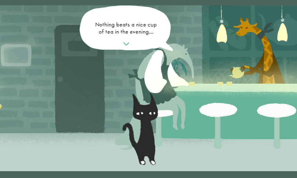
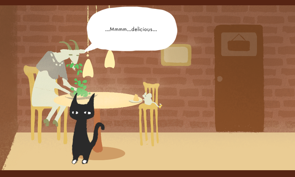
As evidenced by our scores, the strongest point of our entry by far was the look and feel of the world and the mood that we created. We did a great job coming together with @xellaya's background and character designs, @acexl03's speech ui, and my own dialogue writing and music to really flesh out the game and give every area and character its own personality. The game actually has quite a lot of content to explore, especially going back to the same area over different times of day. @xellaya's recoloring and the music variations that I wrote for each time of day really helped to set the mood -- particularly for the cafe, which feels like a totally different place during the morning, afternoon, and evening.
What didn't go so well
Spent a long time coming up with the idea
While I think it was great that we had a prototyping phase during our jam this time around, we really didn't even start with prototyping until Saturday afternoon. We spent Friday night tossing around a lot of different ideas about narrative adventures but none of them seemed to really be sticking clearly as something we had a good idea of how to move forward with. It wasn't until Saturday morning that we really ran with the idea of the music box and the time loop, and even after that we had to flesh out the idea and revise it a few times before we really had something down.
While we didn't do quite as badly as we did with Watch for Falling Rocks (where we completely threw away our game on Saturday and started with something different), this isn't the first time that we've had a lot of trouble settling on a concrete idea for a game. I think a big part of this was just inexperience with the genre -- we had never made any sort of adventure game before, so we were sort of shooting in the dark in terms of how to really start approaching it. But I think part of it as well was that we really did want to take our time and think through our designs without jumping into anything too early, which I think was a good thing. But I do think that we could do a better job of realizing when an idea isn't getting anywhere and that we need to change directions and go along with something different. Hopefully we will get better at this as we get more experience as designers.
Visual style mismatch
Probably the most common complaint we got in the comments was that the visual style of the world map didn't feel like it fit with the rest of the game...which makes sense, because it was drawn in a different style! @xellaya did all of the backgrounds and character art for the main game, but the world map (and the main character's house) were actually drawn by @acexl03! So this was just a matter of having two different artists with different working styles working on the same game.
Would the aesthetic have been better if @xellaya had drawn the world map graphics too? Well...that wasn't actually an option. As I said, @xellaya needed to go in for work on Monday, and as is she already barely had time to finish the backgrounds and characters (did I mention that the school was originally going to have three floors??? Hah!). So there wasn't really much we could have done about it this time around.
People didn't get the theme connection
Another common complaint was that we didn't integrate the theme well enough, for some reason. I don't really get this one...the titular music box is...well, running out of power. The game is about cranking the music box so that it doesn't run out of power... I just... how...?? One comment we received was "how does a music box run out of power, anyway?" It's...mechanically powered by a crank...it runs out of energy...like a regular music box...
While I certainly agree that the mechanism of the time loop was a foggy at best, and the ending of the game was not very fleshed out at all (sacrifices have to be made in the interest of finishing on time!), I don't know if I agree with the theme being disconnected. We didn't want to follow the herd and do a game about electricity or batteries or a countdown timer like the millions of other games that would certainly already be exploring those concepts, but...I guess them's the breaks.
Overall I'm really proud of how our team did, despite the minor flaws and setbacks along the way. It was really great making a more dialogue/narrative-based game like this and I hope I get to do it again! Thanks so much to everyone who played, rated, and checked out our game. See you next time!