Nyamo's Adventure Post-mortem
This is a post-mortem writeup for Nyamo's Adventure.
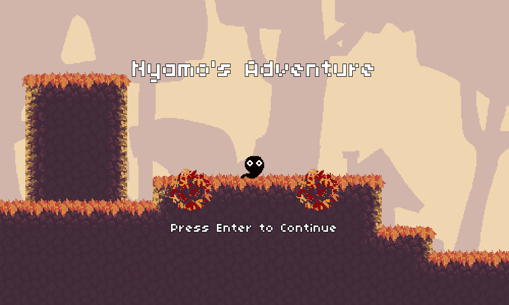
Nyamo's Adventure is our Jam entry for LD35 -- made by yours truly in association with my trusty artist Kat. It's a 2D "Metroidvania"-style platformer game with shapeshifting abilities, multiple worlds to explore, and collectibles scattered about! We're releasing it as part of our "Cocoa Moss" collection of games.
Overall, Nyamo's Adventure was a blast to make! This is perhaps our most solid LD showing to date as a team, and it's really awesome thinking about how far we've come since we made Match Girl way back in LD28. Match Girl was a solid game itself, and was very well-received (2nd place overall!), but just the sheer amount of content and different things that we were able to create this time around for Nyamo's Adventure is really impressive in comparison.
I had 4 "goals" (ish) this time around for LD, and they were:
- Successfully use Unity
- Have fun
- Finish on time
- Make some awesome music :)
I'm happy to report that we managed to hit all four of those pretty well! #2 was a little rough at times (more on that later) but overall things were great!
As always, let's go over what went well and what didn't go so well.
What went well
Unity
Wow! Color me impressed -- Unity really overperformed as a dev environment and editor tool. Now, I've used Unity in the past, so I'm well-familiar with both what it's capable of as well as the little tricks of the trade that you pick up along the way as you work with the quirks of the engine, but I think I still underestimated just how much it allowed me to do when compared with my standard suite of tools (HaxePunk). As much as I'd like to be a hipster and jump on the bandwagon, I can't really argue with what it allowed me to achieve this LD. Having the visual editor around for both editing and debugging was truly invaluable and saved precious precious iteration cycle time when I was trying to design levels, get mechanics working, etc. Here's the entirety of world 3 in Unity's scene view, for instance:
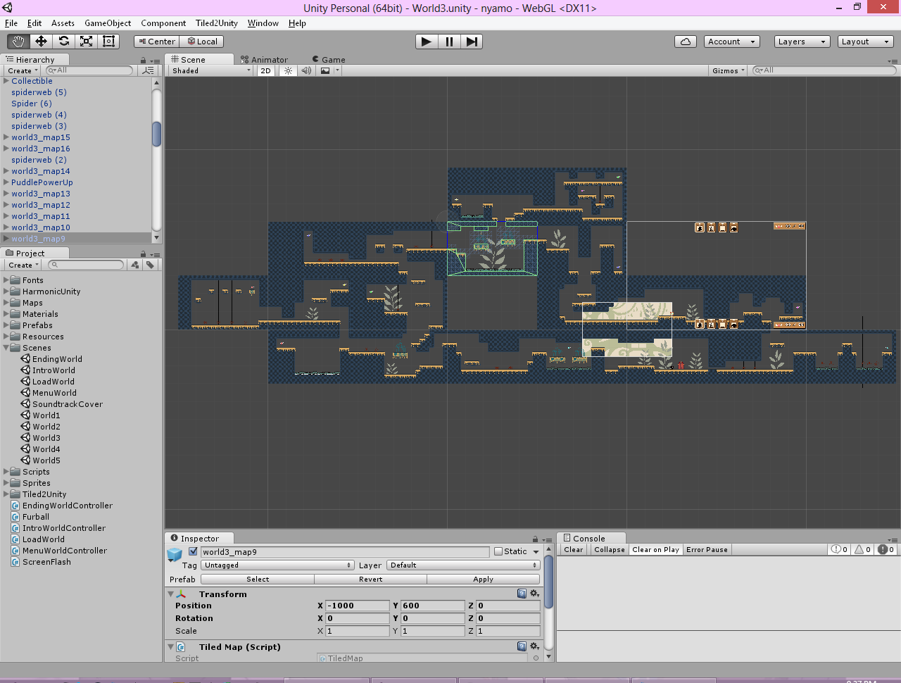
Being able to put the levels, UI, etc. together like this made things so much easier!
Level design and Tiled2Unity
Nyamo's Adventure is a huuuge game compared to some of my other ones. 5 different worlds, each with a bunch of different screens, and the different rooms all fit together in a cohesive way. I spent a LOT of time on level design -- easily more than I actually spent on coding, which was quite surprising at first. Although I've had some experience with platformer level design from the work I did for Match Girl, I had never quite exercised my designer mind like this before. I made sure to read up on some Metroidvania design articles as I was first starting out (which proved helpful), and made sure to really plan out the first few screens of the game in a specific way to introduce the different concepts (moving, jumping, collectibles, the final temple door). I'm actually really happy with how the level design ended up panning out, and how I was able to properly execute the Metroidvania feel. Of course, it's very simplistic and if you really look at it the different worlds are very similar in terms of how they lead you down a linear path to an ability and then use that ability to shortcut back to the beginning. But I think it still works just fine, and designing the rooms themselves was also great thanks to Tiled being a wonderful tool:
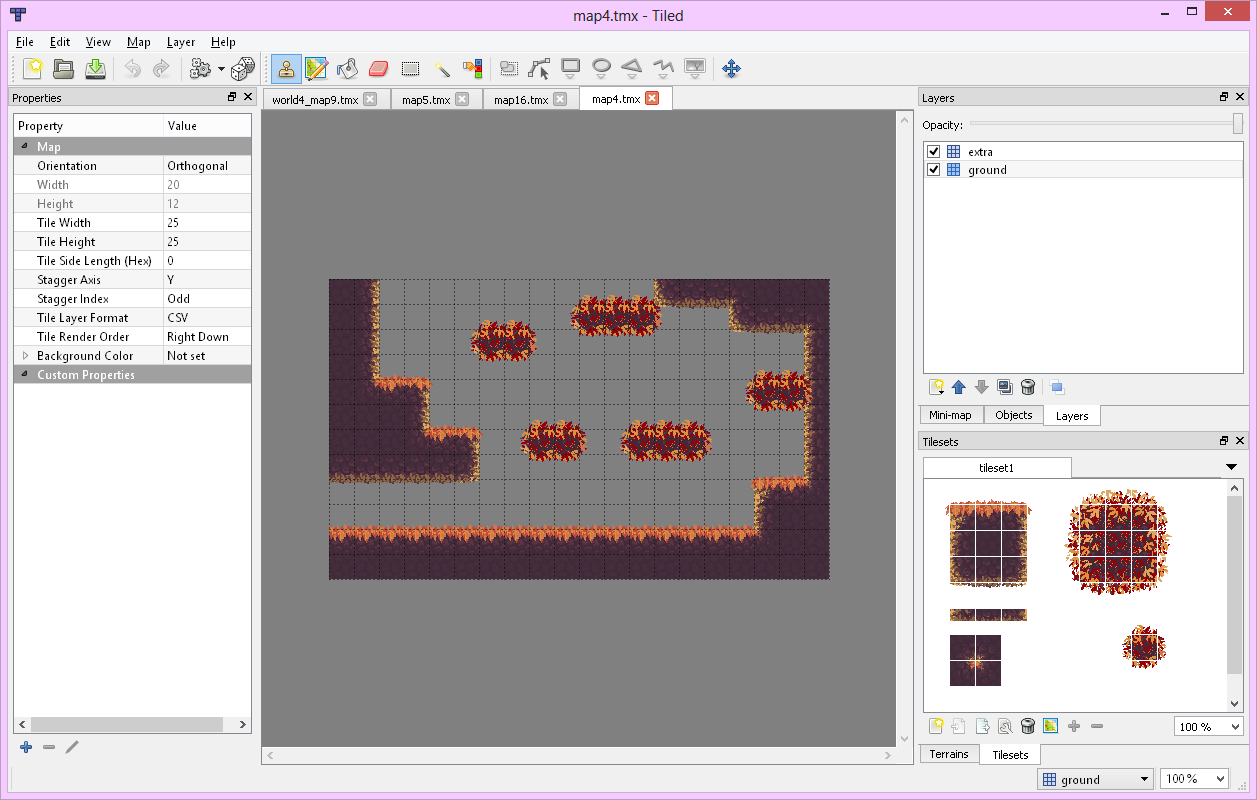
One of the first things I did after we decided on our game concept was to figure out how to integrate Tiled with Unity (something I hadn't done before). Luckily, Tiled2Unity exists, and was very straightforward to set up. Besides a few snafus with our tilesets changing mid-design (was annoying to resolve but was certainly doable), it was pretty straightfoward and just worked pretty much the way I needed it to. Awesome!
Animations, tilesets, and world design
Can we take a moment to appreciate how beautiful the art is in this game?
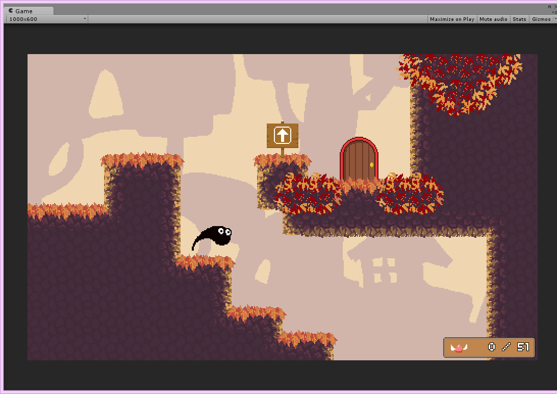
Would you believe me if I told you that this is the first time Kat has worked on tilesets? (besides the single set from Match Girl, which doesn't even count) She really did an amazing job with everything, and it was awesome getting to pull the tiles that she drew into Tiled and using them to build out the different worlds, each with their own palette and feel.
Music
The soundtrack took around ~5 hours in total to write. It was a blast! Nothing really new here -- just standard jamming out like usual. Everything was pretty straightforward, with the notable exception of the Temple theme which was basically my attempt to make something ambient and atmospheric in as little time as possible (11 minutes). It's kind of uninspired, BUT at the same time, I think it's nice that it sounds totally different than the rest of the soundtrack because it helps to communicate the fact that it's a special area.
It's worth noting that I didn't put much focus this time on reusing a shared motif throughout the entire soundtrack -- there's hints of it, but nothing you would really notice unless you're really looking out for it.
Something I realized as I was making this soundtrack was that giving yourself a jumping off point in terms of atmosphere, tempo, or feel really helps in getting things started. I think I started each composition with a very small idea of how I wanted to differentiate it from the others and that helped me get things started. For example, for Autumn Colors I knew that the first world was going to be the "hub" of the adventure and was also going to be an outdoor world, so I wanted something that felt more "open" as well as relaxed. Musically, that translated to a slower tempo, with a laid-back drum beat, and using chords similar to major 7ths. For Take to the Skies, the spring world, I knew it was going to be the first "stage" that you explored after the hub, so I wanted it to contrast with the outdoor hub music, and also wanted it to be more upbeat and driving as you're now getting into the "meat" of the game. Musically, this meant a faster tempo, with more complex breakbeat-type drums. I also knew that the world was going to have an "underwater" palette, so I used some specific instruments to evoke that feeling. (Compare it to Song of the Sea from Melody Muncher to see what I mean) Anyways, the point is that having that starting point allowed me to lay out the tempo and maybe even a drum loop right away, which really worked to get things started (often the hardest part about writing a song).
Soundtrack can be downloaded at https://ddrkirbyisq.bandcamp.com/album/nyamos-adventure-original-soundtrack.
Spikes, knives, and other level elements
I almost feel like this one was luck because of how well it ended up coming together...
So, when I was first thinking of the design of the different worlds, I knew I wanted them to look different, and each feature a slightly different focus on the different abilities that you unlock as you go through the game. For example, the puddle world (the dark one with spiders) was specifically constructed to be more closed-off and cave-like because there would be many places to make use of the puddle ability and it made sense to have tighter corridors.
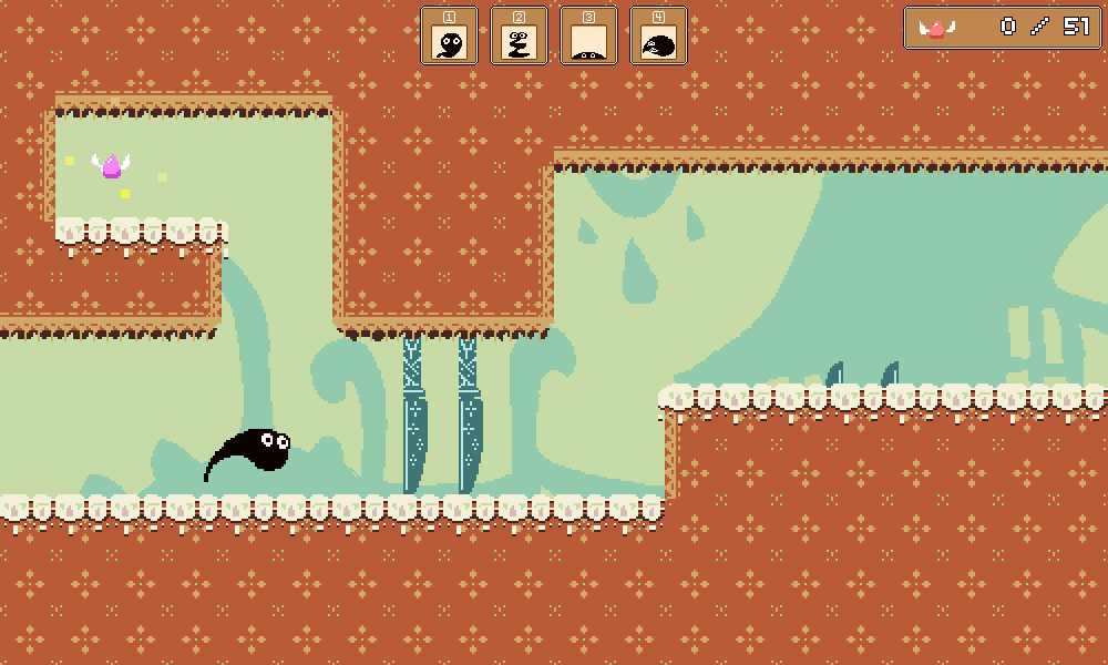
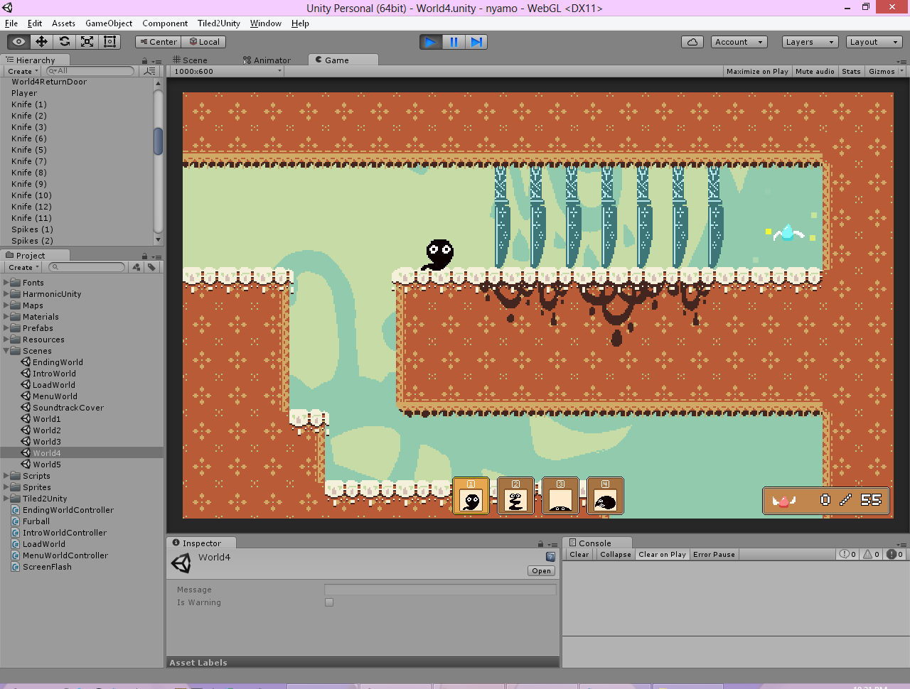
However, there were no plans initially to have a different "gimmick" in each level. That one just sort of happened through development, and I'm glad it did! The disappearing megaman-style blocks (the first thing that I came up with), the spiders, and the knives really did well to differentiate each area and made the level design more interesting than just having different tilesets that were functionally equivalent. I'm especially happy with how the spiders and the knives ended up interacting with the abilities that you find in the respective worlds -- in world 3 you're forced to use the puddle ability to avoid spiders that you can't get past otherwise, and in world 4 you have to use the balloon ability to get past these long rows of knives shown in the screenshot below:
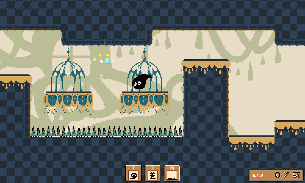
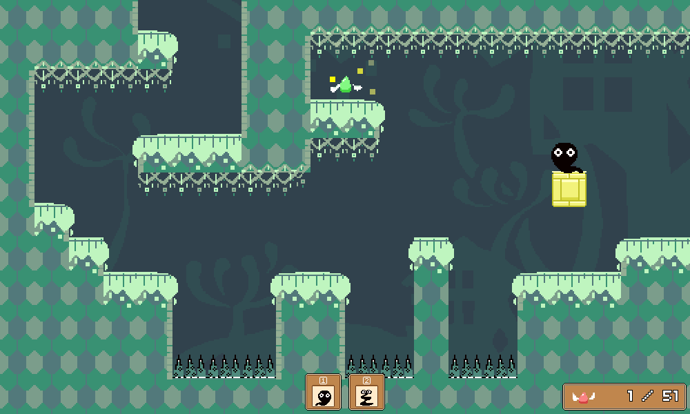
Funny story about the spikes at the bottom of the pits you have to jump over -- for a long time through development I was planning for them to be water or some kind of liquid, as you can see in A Kitty Dream and The Valley Rule (both wonderful references for this type of game, by the way). But throughout development we never got around to putting in the graphics for the water (I had already coded an element that triggers death and a respawn when you touch it), and more importantly, I had no idea how we were going to animate it. In the end we ended up coming up with the idea of using spikes instead and it was a simple, elegant, clearcut solution to the problem that I'm glad we stumbled upon.
What didn't go so well:
2D platformer collision detection
Ugh. I had done a warmup project with Unity to play around with their new 2D features (much improved since the last time I had used them) and to write myself some starter code (for doing basic things like playing sounds, fading the screen, etc.). During that I had done some extremely basic testing to make sure that I could test "collision" (as in, detect when two objects touch/collide and do something), but for some reason I didn't actually bother checking to see whether I could easily implement actual 2D platformer physics. You know, moving and stopping flush to obstacles, jumping and landing on the ground, etc. I have my own set of functions that I used to do all of this in HaxePunk (they are very scrappy but WORK very well at what they need to do), but I didn't have any of that set up in Unity.
So, for the first couple of hours of development I was busy trying to wrestle Unity's engine to get it to do what I wanted it to do...I already knew coming in that the Character Controller / etc stuff was probably NOT what I wanted, yet I also wanted to be able to hook into the built-in collision detection / etc. and leverage that. I did NOT want to have to implement all this stuff from scratch, as that would just be ridiculous. Fortunately I was able to jury-rig together something which worked very nicely, essentially just doing a handful of raycasts on a rectangle as described here. That was pretty much the only major technical hurdle I ran into over the course of the project, but I wish that I had prepared for it earlier. On the plus side, I now get to start building out my set of utility scripts, functions, and prefabs for Unity games, just as I did for HaxePunk, so hopefully this won't be a problem in the future.
Stress
Ugh! I was not in great mental or emotional shape through the weekend and there were some points when I was really not feeling too positive about the project, and in general worried that it just wouldn't come together. This wasn't necessarily due to us being in bad shape, and more just due to me being tired and stressed out due to other RL things (was trying to pack for moving out of my apartment, not enough sleep, etc.) Sometimes this just happens -- unlucky that LD happened to coincide with a weekend when I wasn't fully up to snuff mentally. I also had some congestion in the eustachian tube of my left ear which can be really aggravating when it comes to mixing music. Luckily it all ended up being fine in the en and we made it okay...phew! Was really glad when we finally hit the submit button (and went out for a nice hearty dinner).
Sound design
Kind of a minor point here, but this project taught me that although my music skills are really on point, my sound design skills are not. It was actually pretty difficult for me to come up with good sounds for Nyamo's movement/etc. and I ended up having to redo some of them. The collectible sound also ended up getting changed in the post-compo version to something that didn't clash as much with the background music. Labchirp is nice but sometimes you have sounds that are just tricky to figure out. It's something I need to be conscious of and try to research a bit more.
Unused graphical elements
Kat had some other graphics (like additional background and foreground elements) that she drew up that never ended up making it into the final product. I really didn't have any time to put them in at the time because I was busy scrambling to finish all of the different rooms, but even afterwards for the post-compo version they ended up not really fitting in and looking a bit out of place. You can see in the post-compo version that there are more leaf decorations in the puddle world, but that's the extent of how they worked out. So, not the end of the world, but we probably could have designed some other way of adding some graphical accents to the levels. I think we wouldn't have had this issue so much if we had been working more slowly (i.e. not in a 72-hour game jam) and had time to step back and see what the overall look and feel was going to be like.
That's about all I have to say about Nyamo's Adventure! It was an awesome experience to make, and I hope you all enjoy it as much as we did! :)